INTRODUCTION
The objective for this project was to create a product that would allow health-conscious individuals to log in to a responsive health & wellbeing portal to record their health & medical information, as well as access general physical and mental wellbeing features.
My Role- UX Researcher, UX Designer, UI Designer
Tools- Figma, LucidChart, Zeplin, OptimalSort, UsabilityHub, Miro, Illustrator
PROCESS
To structure the course of this project I used Design Thinking Process to allow for a non-linear and creative way of working.
With this process, a problem can be understood and defined in order to develop innovative solutions. Thereby, the focus is always on the users, technological feasibility and economic requirements.
Empathize
Empathize
PROBLEM STATEMENT
Users need an inclusive & intuitive product to help make meaningful lifestyle improvements to their health & wellness using personalized data & feedback.
We will know this to be true when we see users stay committed to integrating our product into daily life & provide positive ratings about their success with the product.
COMPETITIVE ANALYSIS
I created S.W.O.T. profiles for two mood journaling competitors, Moodflow & Daylio.
Analyzing the current wellness app landscape allowed me to see how they’re experiences & design could influence my own wellness tracking app & to more accurately understand the current market and competitors in the space.
MOODFLOW
STRENGTHS
Affordable, the free version is very good and the monthly subscription gives the user even more features at a low cost
Good UX/UI design
Customizable
Let’s users track medications
Opt-in ads are great because it make Moodflow feel more like a journal even in the free version
WEAKNESSES
Limited guidance on how to utilize app content
There is no direct research supporting the use of Moodflow
Only tracks moods, sleep & medications
OPPORTUNITIES
More consumer education on the benefits of mood journaling.
Even more user customisation options
Make it easy to share journal with therapist
Have a one time purchase option instead of just a subscription
Could add more subjects for users to track
Allow videos to be added to journal entries
THREATS
Bigger and more popular mood journaling options in the digital space
Users may not commit long term use or to lifestyle changes
DAYLIO
STRENGTHS
Customizable
The app is free and many features available without purchase of the premium version of the app
App provides support for interpretation
of data, making the statistics easy to understand
Effective daily reminder to prompt
consistent use
WEAKNESSES
Must purchase the app for more sophisticated, in-depth statistics
Limited guidance on how to utilize app content
No direct research supporting the use of Daylio itself
Distracting in-app Ads
Only allows one photo per journal entry
OPPORTUNITIES
More consumer education on the benefits of mood journaling.
More customizability to the rating system for more nuanced moods. Currently you can only pick 5 levels that actually show up on graphs.
Allow users to attach videos with journal entries
Offer a one time payment option to subscribers instead of only a monthly payment plan
THREATS
Similar mood journaling products in the digital space
Users may not commit long term use or to lifestyle changes
Define
Define
USER RESEARCH
GOALS:
To better understand users’ daily habits & time commitments.
To understand what motivates participants to care about their mental health.
To better understand the pros & cons of mood tracking apps they have used in the past.
To understand what users are looking for in a mood tracking app.
To identify what daily goals, routines & activities users would like the app to track.
PHASE 01:
USER SURVEY
For my user research I started by conducting a user survey to gather initial insights from users and to obtain findings from a larger sample population. This quantitative data helped me quickly determine whether my theories were headed in the right direction. The survey also helped inform how I would structure my user interviews and what questions would be most helpful to ask participants.
PHASE 02:
USER INTERVIEWS
Informed by the data from my survey I next conducted four user interviews so I could identify users’ needs/goals & directly observe participants during the sessions. This helped me gather attitudinal & qualitative data so I could begin understand my product through my users’ eyes.
PHASE 03:
AFFINITY MAPPING
Using the data and quotes collected during my user interviews, I created a series of affinity maps to organize my data. This allowed me to more thoroughly understand my user and their motivations. I also used my data to brainstorm some affinity clusters to help discover new features users may find valuable in my product.
-
• 40 Participants
• Survey was live for 24 hours using the platform Survey Monkey
• 8 Questions
• Promoted on Facebook and Slack
-
• 4 Participants
• 3 Interviews conducted remotely via Zoom and 1 interview conducted in person
• 12 Questions
• 20 Minute Sessions
WHAT I DISCOVERED
〰️
WHAT I DISCOVERED 〰️
USER RESEARCH DISCOVERIES
My user tests revealed that participants have more of an interest in physical health then I originally anticipated. Participants want to focus on their health and wellness but have so little time to focus on themselves. Users want to see correlations between their moods and their activities and get an overall picture of their health through data.
Here are some of the stats that will help inform my product design moving forward:
84% of participants view their mental health as extremely important
66% of participants are experienced using health & wellness apps
50% of participants were either not aware or somewhat aware of how of how their daily routine correlates to physical and mental health
70% of participants are either currently in therapy or have seen a therapist in the past and 1/3 take more of an independent approach to mental health.
63% of participants want fast journal entries that take under 3 minutes.
Point of View
Point of View
PERSONAS
To better understand the point of view of my target audience as objectively as possible.
I developed two main personas to represent the real potential users from my interviews & surveys to help me keep the end user front of mind throughout the duration of the project.
SABRINA
The organized Author
ABOUT
Age: 30
Occupation: Author/writer
Location: San Francisco, CA
Family: Married 4 years, No children
“ I struggle with anxiety and depression. I want an app that will improve my awareness of what affects my mental health and help me become a happier version of myself. ”
I NEED
Needs tracking and data to see correlations between her daily activities and how they affect her moods.
Period tracker
Wants to work on her anxiety and depression
Personalized profile and data
I WANT
Sabrina wants a fast way to track different data points to become more self-aware of what affects her internal state
Wants to be able to share her journal with her therapist
Wants to see how her diet, menstrual cycle and exercise affects her moods
I DON’T LIKE
finds in-app ads distracting and invasive
Sabrina gets frustrated by irrelevant data points that clutter her profile with pointless information
I DO
Sabrina works for herself but often likes to work from cafes or galleries to get a change of scenery
Sabrina is a night owl and often has her best ideas late into the night
Sabrina like to do 15-20 minutes of light exercise every morning to get energized
NOTABLE QUOTES
“ I've kept a diary before. It helps to vent, but is time consuming, so I don't do it too often.”
“ Exercise has helped. Being aware of my stress and anxiety helps and puts it in perspective. ”
XAVIER
The Busy Graphic Designer
ABOUT
Age: 33
Occupation: Graphic Designer
Location: Boston, MA
Family: Single
“ I have a demanding job working well over 40 hours a week. I want to squeeze in mental and physical health when I can and see data on my progress.”
I NEED
Needs digestible data
Needs a product that can track sleep patterns, exercise, and diet
Needs fast and effortless mood and data logging
Goal is to make health more of a priority
I WANT
Xavier wants to get in better shape and feel more confident
Wants to improve his work/life balance and needs a wellness tool to help him focus on himself and avoid burnout
Wants to track his morning routine and use that time productively
I DON’T LIKE
Xavier doesn’t want to waste time inputting and organizing data
Doesn’t like inefficient apps
Doesn’t like when he can’t sync his app across all his devices.
I DO
I work 6 days a week, sometimes remote and sometimes from the office
I am constantly juggling several projects for work
At night, I enjoy gaming and relaxing
NOTABLE QUOTES
“ I struggle with daily stress and mild anxiety specifically around work. I difficulty managing my work/life balance which affects my mental health.”
“ I'd like to be better about taking care of my physical health more in eating better and losing some weight.”
Ideate
Ideate
JOURNEY MAPS
I created the following journey maps to better visualize the thought processes the persona goes through in order to accomplish goals in the application.
SABRINA
The organized Author
SCENARIO
Sabrina has been logging her moods and activities all week. She now is going to her therapy appointment and wants to access her weekly data to send to her therapist so they can discuss it in the session.
GOALS & EXPECTATIONS
Sabrina wants to use her daily logging to show correlations between her actions and her moods
Gain insight into her depression and anxiety .
Expects mood journaling will also help her therapy sessions
PHASE
Select Data Points to track
Input desired data
Access weekly data charts
Link to Personal Therapist
ACTIONS
Opens the app
Customize profile
Identify what would be personally useful to track
Rate current mood
Select from a list of descriptive words
Select from a list of activities for the day
Go to dashboard to see results for the week
View the calendar to see moods for each day
Go to profile
Select the dates she wants to send to her therapist
Link data to therapist so they can discuss in session
THOUGHTS
“ I feel overwhelmed sometimes with all chaos inside my head.”
“ I want to organize my thoughts and feelings.”
“Seeing the correlations between my moods and activities will help me understand my anxiety.”
“Keeping track of my week will help me remember how I was feeling on each day.”
FEELINGS
1. I don’t understand my anxiety
2. Hopeful tracking activities will give new insight
3. Interested to see patterns emerge
4. Excited to send data to my therapist
XAVIER
The Busy Graphic Designer
SCENARIO
Xavier wants to be better about his work-life balance. He wants to take part in a challenge to help him stay motivated to work out everyday, eat healthy and get a better night's sleep.
GOALS & EXPECTATIONS
To improve his physical fitness
Enhance his self- confidence
Stay committed to focusing on himself and achieve a better work-life balance
PHASE
Select Data Points to track
Choose a workout challenge
Log workout for 30 days
Reach goal & form new habits
ACTIONS
Opens the app
Customize profile
Identify what would be personally useful to track
Scroll the list of goals and challenges
Schedule reminders
Track goals along with the other data points
See how physical health correlates to mental health
Goal is achieved
Challenge is listed in your accomplishments on profile page
THOUGHTS
“ I am really consumed by my job right now and I forget to focus on myself.”
“ I think a challenge would keep me motivated and bring out my competitive side.”
“ I have days I don’t feel like working out but I want to keep my streak going.”
“I feel like the first 30 days allowed me to change my routine to have time for healthy habits.”
FEELINGS
1 Feeling overwhelmed
2. Excited about starting a new challenge
3. Losing some momentum
4. Happy for completing the challenge
USER FLOWS
〰️
USER FLOWS 〰️
TASK ANALYSIS & USER FLOW
I next created a task analysis for each persona to determine what tasks are required to achieve an integral function within the application.
SABRINA
The organized Author
O B J E C T I V E
“As a person who struggles with anxiety & panic attacks, I want to share my mood journal data with my therapist, so that we can review the information in our sessions.”
ENTRY POINT:
Launch app
SUCCESS CRITERIA:
When Sabrina has transferred her data to her therapist.
TASKS:
Launch app
Login to account
Dashboard
Select Data/calendar page
Fill out dates you want to send & who you want to send to
Review and confirm
Send data
XAVIER
The Busy Graphic Designer
O B J E C T I V E
“As a busy professional, I want to take a 30 day workout challenge, so that I can jumpstart a new routine and make time in my busy schedule to focus on my health.”
ENTRY POINT:
Launch app
SUCCESS CRITERIA:
When Xavier has selected a challenge and adds it to his dashboard
TASKS:
Launch app
Make an account
Onboarding
Dashboard
Select challenges page
Scroll through challenges offered or create your own
Select challenge
Read challenge description
Set desired notifications
Review your challenge
Add challenge to dashboard
CREATING THE SITEMAP: ITERATION 1
The sitemap outlines the hierarchy of the application. My initial iteration of the sitemap was created with the personas in mind but it would still need to be tested.
REFINING THE SITEMAP with CARD SORTING
To refine the Information Architecture & the Sitemap of my product, I conducted an online open card sort workshop using OptimalSort with 7 participants.
Participants were asked to group nineteen cards into groups and categorize those groups with their own labels. It took participants an average of 9 minutes and 8 seconds to complete the task. I chose an open card sort so I could gain insight on what categories and structure would be most intuitive so users can easily navigate my products features.
Check out additional card sort data:
THE SITEMAP
〰️
THE SITEMAP 〰️
SITEMAP- ITERATION 2
Informed by my looking from the perspective of my persona, I was able to make the following five iterations to create the final version of my sitemap.
SITEMAP ITERATION 01
I originally had my site map organized into 6 main tabs but after my card sort I decided to consolidate my “Settings” tab and my “Account” tab into just an “Account” tab. I then dispersed the pages into my remaining 5 tabs based on the data from the card sort.
SITEMAP ITERATION 02
I deleted the “Wellness resources” tab because it didn’t really seem to have a home within my structure.
SITEMAP ITERATION 03
Overall the card sort helped me refine my sitemap to be less bulky and more interconnected than my first design.
SITEMAP ITERATION 04
I created sub-categories and incorporated more hierarchy into my sitemap.
SITEMAP ITERATION 05
My participants seemed to want to organize my card into 3 groups but I did want to maintain 5 main categories just to make the product easier to navigate, so I interconnected more tabs then I had originally.
Wireframe
Wireframe
LOW FIDELITY WIREFRAMES
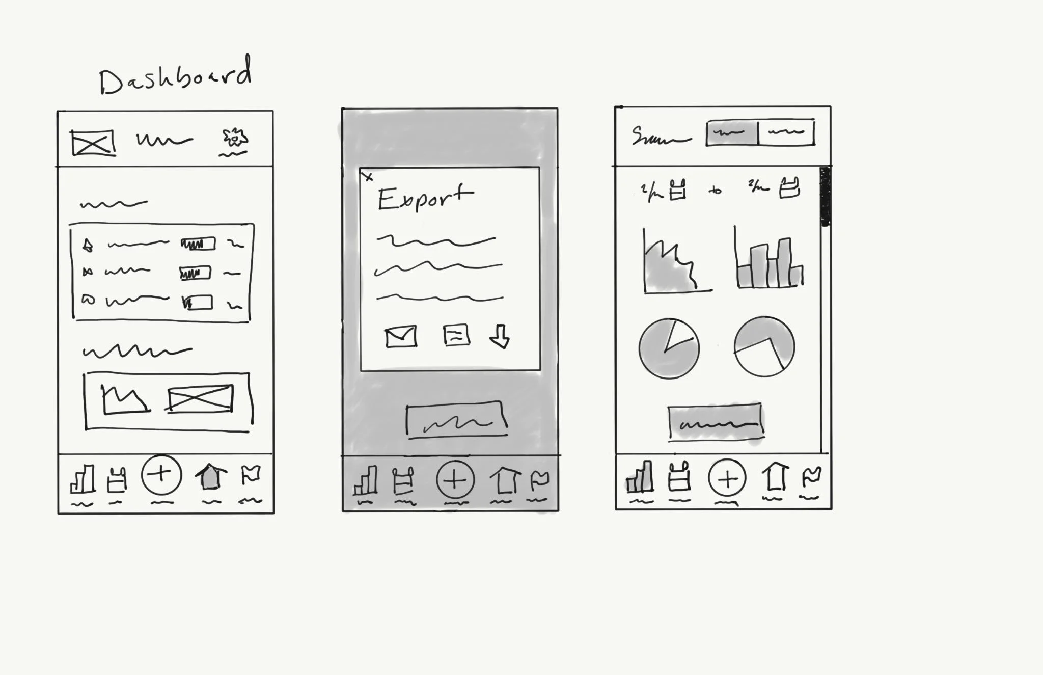
This low fidelity wireframe is the first translation of my previous research.
The idea is to focus on the core features and the big picture of the project without spending time on small details (visuals, spacing, colors etc.). Hand drawn wireframes are a great communication tool to address to the team, stakeholders and to potential users. Because they are easy and quick to draw, we can explore the benefits of the iteration process.
Prototype
Prototype
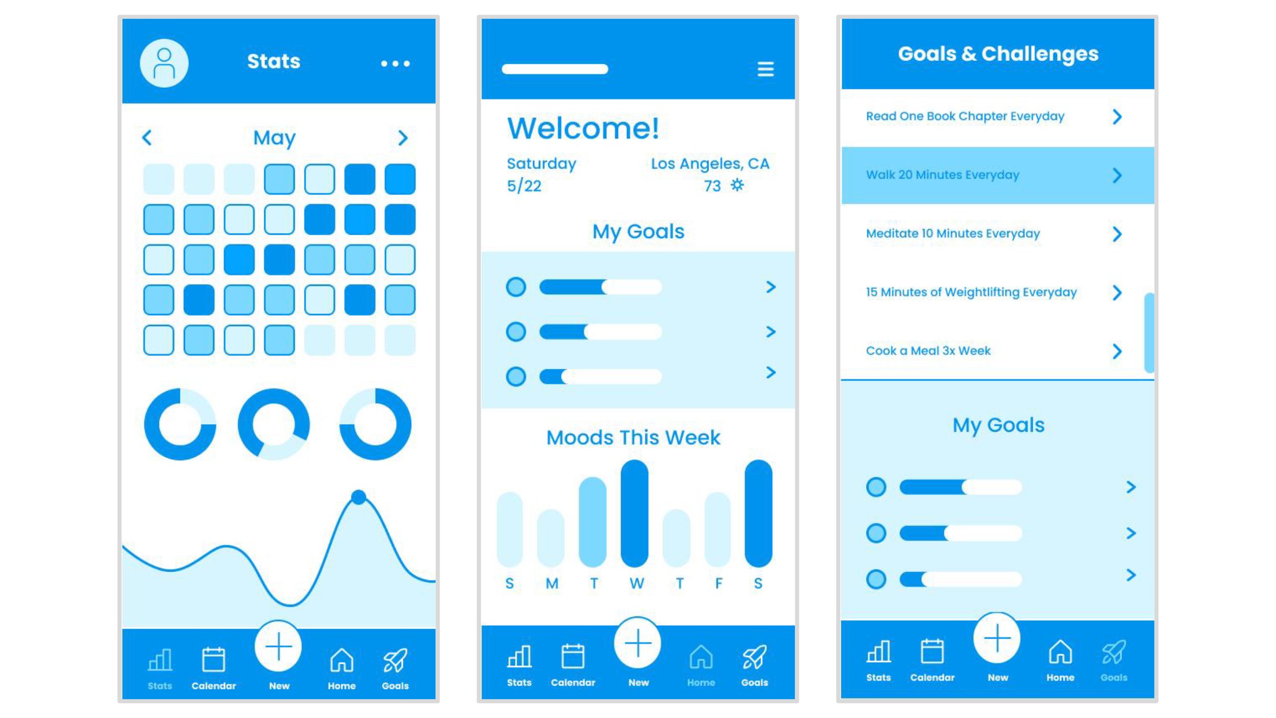
MID-FIDELITY PROTOTYPE
After producing low fidelity wireframes, feedback is collected from users and stakeholders to create more detailed digital mid-fidelity prototypes.
No colors or graphics are used at this stage so the design is as simple as possible to facilitate the iteration process. This prototype is used as a minimal viable product: it is an interactive prototype that has just enough features to be tested by users and then to gather their feedback for improving the design.
PROCESS TO ONBOARD
-
➔ Swipe through Onboarding screens
➔ Select either “Get Started” button or “Sign In” link
➔ (If “Get Started” button is selected) then create a new account
➔ ( If “Sign In” link is selected) continue to sign in screen
PROCESS TO ENTER A LOG
-
➔ Select “New” icon on Dashboard Screen
➔ Select desired date
➔ Scroll through log screen and input your data
➔ Select “Customize” button
➔ Turn on toggle for desired tracking options
➔ To save your log customizations, select "Save Changes” button
➔ To save your log entry select “Save Entry” button
PROCESS TO SHARE STATS
-
➔ Select “Stats” icon on Dashboard Screen
➔ Select “More” menu icon on top navigation bar
➔ Select “Share my stats” on the drop down list
➔ Once in the popup, fill out empty fields with recipient and desired information
➔ Select “Send” button
➔ Exit out of popup to return to Stats Screen
PROCESS TO ADD A NEW CHALLENGE
-
➔ Select “Goal” icon on Dashboard Screen
➔ Scroll through Goals/Challenges list
➔ Select desired challenge
➔ Read through challenge description
➔ Set desired notifications
➔ Select “Add Challenge” button
➔ Exit out of popup to return to Challenge Screen
Test
Test
Now that I had designed my MVP prototype I would have to test how it would hold up with real users. To accomplish this I ran a series of tests including a Preference test to inform some upcoming UI decisions and a usability tests to see if users were able to successful navigate my prototype to accomplish a series of tasks.
This test was in the hopes to flush out any areas of friction participants may encounter and fix any broken elements of the initial design that may be broken throughout the user experience.
USABILITY TEST
To gather some evaluative research on my prototypes design, I conducted six usability tests. This gave me insight about how real users interact with my prototype, what they do and where they struggle.
TEST PLAN
-
-Observe if users can sign in or sign up successfully.
-Observe if users can understand and navigate the app.
-Observe if participants can complete a log entry and customize log content categories
-Observe if users can share Stats
-Observe if participants can set new goals/challenges
-
The study recruited 6 participants within my personal network. Participants were all ages and from a mixture of demographics. See full test plan here.
-
This test was conducted via Zoom. Prior to the test I explained to the participants what to expect during the study. The participants were given four tasks to complete with the Figma prototype, and their feedback was recorded and collected.
-
For a detailed look at the test script, including all of the tasks I tested, feel free to explore the complete script here.
ORGANIZING THE DATA
〰️
ORGANIZING THE DATA 〰️
AFFINITY MAP
To dissect the vast amount of data from my usability testing I created an Affinity map, to help me condense quotes & observations into concise pieces of information that I could then group together to determine patterns.
Once I had basic information & patterns identified, I processed that information using the Rainbow Spreadsheet. The purpose of this sheet was to classify important observations and errors by presenting my results in a visually organized fashion. This spreadsheet is also a helpful visual resource for stakeholders in the project and will help to inform my Usability Test Report.
Affinity Map
Rainbow Spreadsheet
WHAT I DISCOVERED
〰️
WHAT I DISCOVERED 〰️
THE USABILITY TEST REPORT & DESIGN ITERATIONS
The feedback I received from my participants while engaging with my prototype did reveal areas of friction & confusion for my potential user if I didn’t fix my design. I used the Jakob Nielsen Rating Scale to rate the degree of severity of the usability issues participants encountered.
I also gauged participants satisfaction using the Single Ease Question 5-point rating scale after each Task. 1 (really bad UX) to 5 (excellent UX). These are top 5 issues that my usability testing revealed & the iterations I made to fix the issues in my mid-fidelity prototype.
-
0 = I don't agree that this is a usability problem at all
1 = Cosmetic problem only: need not be fixed unless extra time is available on project
2 = Minor usability problem: fixing this should be given low priority
3 = Major usability problem: important to fix and should be given high priority
4 = Usability catastrophe: imperative to fix before product can be released
ISSUE 01
SEVERITY RATING 02- “No back button when making an account”
EVIDENCE:
40% of participants pointed out that they could not go back when creating a profile and expressed this was an issue for them.
DESIGN ITERATIONS:
Added back arrows
Added more information icons to educate the user about different tracking features
ORIGINAL
UPDATED
ISSUE 02
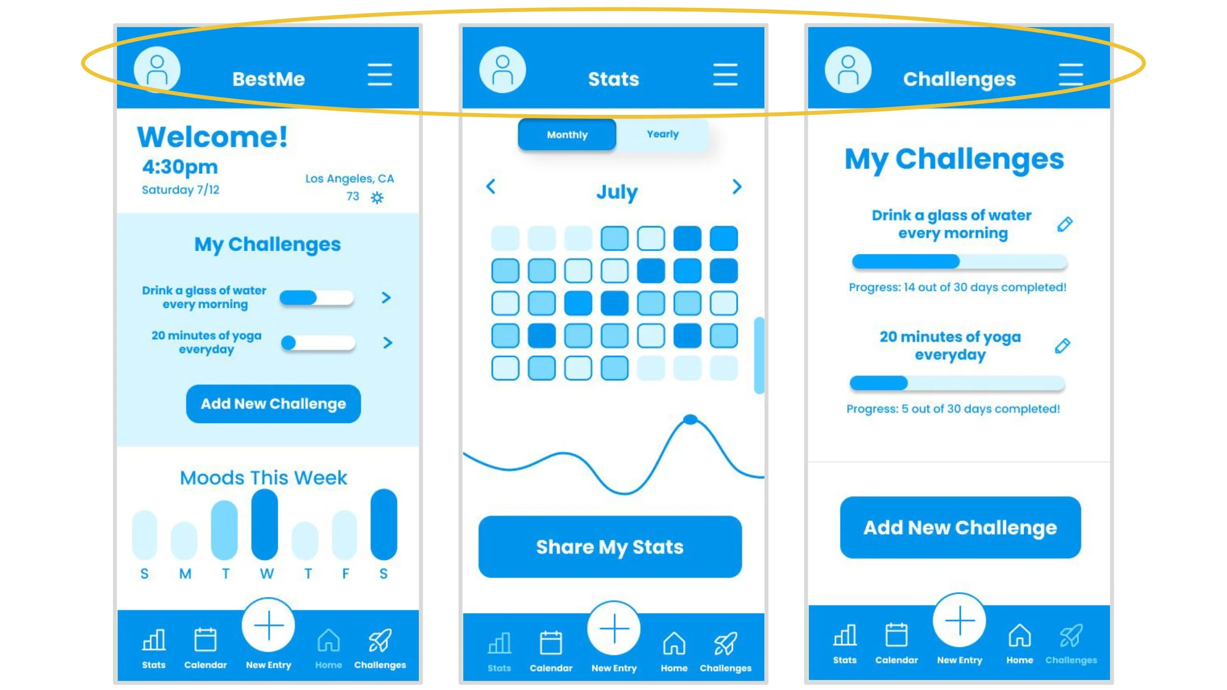
SEVERITY RATING 02- “The top menus are different from page to page”
EVIDENCE:
50 % of participants mentioned that the top menus being different on every screen was disorienting to them and speculated it would be difficult to familiarize with the app.
DESIGN ITERATIONS:
Made all the top navigation consistent with a profile icon, a settings hamburger menu and a page label to orient the user
ORIGINAL
UPDATED
ISSUE 03
SEVERITY RATING 04- “The “New” button is not specific enough”
EVIDENCE:
100% of participant were confused on some level about the navigation of the app. The “+” button was not named specifically enough so participants got confused and frustrated.
DESIGN ITERATIONS:
Changed the name of the plus sign icon to “New Entry” for clearer navigation
Added a button to “Add New Challenge” so users can navigate directly from the home page
ORIGINAL
UPDATED
ISSUE 04
SEVERITY RATING 03- “No way for the user specify what data they want to send”
EVIDENCE:
40% of participants expressed an interest in wanting to be more specific about what data they share and pointed out that with my current design, the sharing experience hadn’t been fully developed.
DESIGN ITERATIONS:
Added a “Share My Stats” button
Created experience that allows user to share more specific data
ORIGINAL
UPDATED
ISSUE 05
SEVERITY RATING 04- “The Goals page has no indicator on what to do”
EVIDENCE:
80% of participants mentioned that the goals page was confusing and not clear. The wording was not consistent and users had no way to edit goals.
DESIGN ITERATIONS:
Changed the inconsistent usage of the word goal and challenge to just challenge
Changed the layout of the page and added an “Add New Challenge” button
Added an icon to edit current challenges
Added more explanation of the challenge feature of the app
ORIGINAL
UPDATED
PREFERENCE TESTING
〰️
PREFERENCE TESTING 〰️
A/B TEST
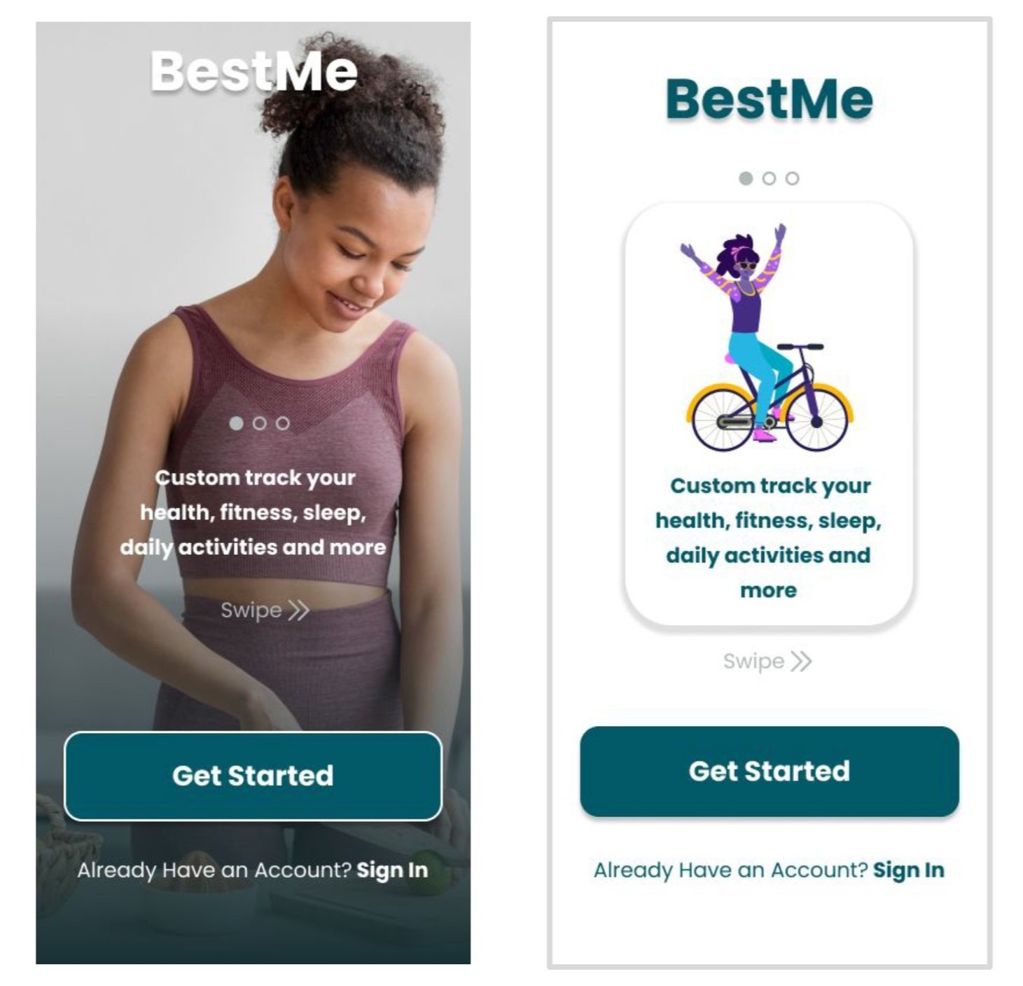
My goal for A/B testing was to see whether participants prefer a realistic picture or an illustration for the onboarding of my app.
The two designs I created for testing had similar functional layout but with some image & pallet differences. The test also included a question for participants to describe why they prefer one design over the other.
METHODOLOGY
For my preference test, I used social media to recruit 38 participants from my personal network. The test was conducted through UsabilityHub and compared two versions of the BestMe onboarding screen.
DESIGN B
DESIGN A
Which design do you prefer?
RESULTS
Preference test results were clear with 66% preferring design A.
Participants commented that they felt the image was more relatable, professional and overall more appealing.
ADDITIONAL THOUGHTS
I did observe a recurring theme when reading through the comments that the individuals thought the photo I selected was intimidating & not relatable to them personally. Participants felt the photo pressured them to live up to the “ideal person” that the app is promoting. I don’t want my product to feel intimidating to users, to remedy this I will include a variety of genders, body types and activities for my different onboarding screens so that the design is more relatable and approachable to everyone.
Refining the Design
Refining the Design
PEER REVIEW
For further feedback I reached out to some of my peers at CareerFoundry on the Slack community channels.
I received feedback from 6 peers on my BestMe prototype. In this section, I outline the changes I made based on feedback.
Onboarding
Based on the feedback I received I disabled the “Sign up” button until the user inputs the required information. I also used the brand colors of the social sites and spaced them farther apart.
UPDATED
ORIGINAL
“You could disable the sign-up button until all the fields have been completed.”
“Just wondering if that icons should have their original colors (I know that from visual perspective it wouldn't look so clean and nice), however it might make a difference for users, who already recognize it”
“I would spread these three icons a bit more so they line up perfectly under the text right above and have some nice space between themselves”
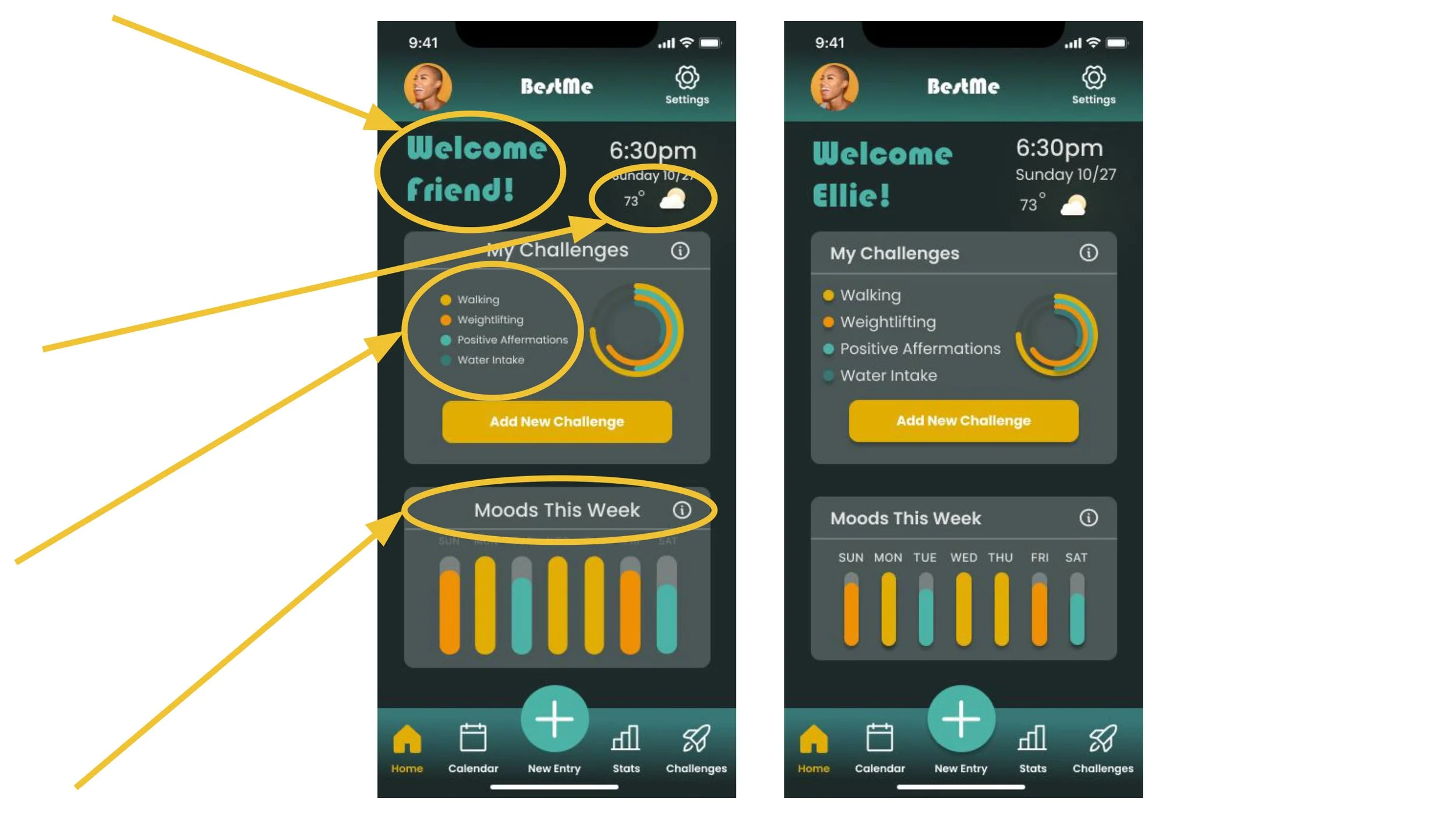
2. Dashboard
Based on the feedback I received I customized the greeting on the dashboard based on the users name. I also made the text throughout the page bigger and brighter.
UPDATED
ORIGINAL
“Ooh it would be cool if it said, "Welcome, Kat" for it to be more personable for me using the app”
“I would use one of your brighter colors for the days since they blend in a bit too much here”
“Temperature text is a bit small”
“Text feels a tad bit too small”
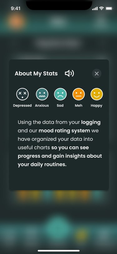
3. Stats Screen
Based on feedback I added a tooltip popup to explain how the stats page works. I also made text bigger and left aligned the graph titles.
UPDATED
ORIGINAL
“I feel that there is so much negative space to the left of this header and the rest going down, maybe try moving it to the left for all of them and see how it looks?”
“hmm I do love love the layout although I am unsure what all the colors mean. it would be nice it there was like a help section or maybe a coachmark/onboarding regarding the colors?”
“Text just looks a tad bit too small”
4. Entering a Log
Based on the feedback I received I labeled the emotions in the mood rating system. I made the text bigger and more spaced out. I designed what the interaction would look like if you selected an emotion. I also redesigned the “+” and “-” buttons to an “Edit” button to be more clear.
UPDATED
ORIGINAL
“For a better understanding, I would consider adding tags to these emojis. Although the 4th and 5th ones are easy to interpret, I am quite confused with the 1st and second”
“The text here is a bit small. it seems they are all center-aligned. left aligned might look better”
“Not really sure what the plus and minus buttons are for”
“What does it look like when I've selected an emotion? Does the text become coloured?”
5. Adding New Challenge
Several people gave feedback that the text was difficult to read over the images so I added a blur layer behind the text to make them more legible.
ORIGINAL
UPDATED
“White text is a bit hard to read for the last one, might I recommend having a blurred (effect), 25-30% transparent grey box (color #595959) behind just the text? It did wonders for mine”
“White text is a bit difficult for the last 2 images due to the white in the images.”
6. Challenge Screen
Based on the feedback I received I made the text bigger and changed the title of “My Achievements” section to “My Completed Challenges”
ORIGINAL
UPDATED
“The font underneath the title it a bit small and so visually impaired may have a hard time. although, like I said before the layout is great. loving it”
“I love this section. I love the graphics and the spacing. Although I don't really get what its for.. I’m assuming they are like badges? or are they having to do with your challenges above. and so the titles of your challenges are the name of different achievements?”
Designing for Accessibility
Designing for Accessibility
DESIGNING FOR ACCESSIBILITY
I wanted to ensure those with disabilities would be able to interact with the BestMe app,
I tested the colors, contrast, & font sizes of the application using the WCAG guidelines and the Figma plugin Stark. Keeping accessibility front of mind I made 5 main changes to my design to improve the user experience for all when using my product.
I labeled input fields & used color as a means of conveying information
ORIGINAL
UPDATED
Included symbols and labels so the color is not the only means of conveying information to be inclusive of color blind users.
2. I increased contrast between text & the background
Labeled input fields to improve accessibility for the visually impaired
ORIGINAL
UPDATED
3. I added an audio option for large text blocks for visually impaired or dyslexic users
4. I changed the toggles from my app pallet to keep symbols universal & keep to UX best practices.
ORIGINAL
UPDATED
Changed my “On” toggles to green to keep with UX customs and make their function clearer for users.
5. I increased the font size throughout my app to assist the visually impaired
ORIGINAL
UPDATED
Final Deliverables
Final Deliverables
DESIGN LANGUAGE & DEVELOPER HANDOFF
I created a document with the design language system for handoff to the development team to bridge the gap between design & development. I also uploaded the assets into the program Zeplin to organize content and components.
HIGH-FIDELITY PROTOTYPE
By implementing the Human-Centered Design process I was able to design & craft this high-fidelity prototype:
What's next?
What's next?
FUTURE ITERATIONS
A hypothesis I have is that creating a smart watch app would help with user engagement & streamline tracking. If data is automatically inputted, it will be an easier user experience & yield more accurate results.
I anticipate that by having most of the data automatically tracked and collected into a central location with minimal manual input required of the user, long term BestMe will become a valuable tool in users health and wellness journey.


