INTRODUCTION
In this project, the objective was to create a product that would facilitate users in their goal of memorizing and understanding new concepts, techniques, and terms by researching and designing an app to learn new vocabulary.
My Role- UX Researcher, UX Designer, UI Designer
Tools- Figma, LucidChart, Zeplin, OptimalSort, UsabilityHub, Miro, Illustrator
PROCESS
To structure the course of this project I used Design Thinking Process to allow for a non-linear and creative way of working.
With this process, a problem can be understood and defined in order to develop innovative solutions. Thereby, the focus is always on the users, technological feasibility and economic requirements
Empathize
Empathize
COMPETITIVE ANALYSIS
To get a better understanding of the Vocabulary Mobile Application landscape and the teaching techniques they utilized I downloaded a few of the most popular language learning apps to try out for myself.
Exploring these apps gave me a lot of insight into what works for these products & areas of friction to help inform my own product.
Duolingo is an addictively fun language learning app.
The cute characters and bonus gifts make learning a new language feel like a game. The way lessons mix up the format of the questions is an effective tool to help the user memorize new words and gain confidence quickly. The auditory aspects of Duolingo are also very successful and the words are read out to the user so you learn proper pronunciation. Aspects like the fire streak for learning everyday and free gifts for completing lessons will surely keep users coming back for more. Losing hearts for incorrect answers is a bit depressing and could hinder the learning experience for non Plus users. Though the characters are fun there are a lot of them and some may not be intuitive. This could overwhelm the senses for new users and lead to confusion. Overall Duolingo is a very effective and fantastically designed app, that will undoubtedly help anyone who commits to it learn a new language in an effective and entertaining way.
ONBOARDING
-
• Progress bar shows users how far they are in the Onboarding process.
• Simple and digestible content that is inviting to new users.
• Tailors learning experience to new or intermediate language learners.
-
• The language selection scroll goes on too long. The user doesn’t have the opportunity to select their native language, instead scrolling through every language and all the learning opportunities for that individual language.
VOCABULARY LESSON
-
• Pronounces the new vocabulary for the user as they learn.
• Colors are used in an effective way to indicate correct and incorrect answers along with sounds.
• Same words are asked in different formats which is effective for memorizing.
• Progress bar shows how far users are in the lesson.
-
• The user is forced to finish first lesson as soon as they open the app or progress is lost.
• It isn’t initially explained what the lightning bolt icon means.
• When users get an incorrect answer they lose a heart and hearts are needed to continue learning so that could be hurtful to the user experience.
FEATURES & NAVIGATION
-
• App UX has built in incentives to encourage the user to continue learning, like a fire streak for learning everyday and gifts when you complete a lesson.
• Simple and clean content makes the app easy to navigate.
-
• Some of the icon meanings aren’t clear for new users.
• Unlimited hearts are only provided for Plus users as an incentive to monetize the app but could halt the learning experience for free users.
The learning exercises in Memrise are cultured and thoroughly designed to be an engaging experience for users.
The short videos of native speakers using the language in context makes the user feel like they are traveling and interacting with the language. This will resonate with a large audience of users with the end goal of travel. Memrise not only provides the user with the translation but also the literal meaning of the words or phrase. The way the question formats are changed and asked repeatedly is an effective way to strengthen memory. Daily goals are used as a way to keep the user coming back to learn more everyday and it is very simple to change and add new languages to learn. Unfortunately the menu experience is disorienting with no clear hierarchy. The user profile has relatively little information on it, instead the user has to find several other pages to get a clear picture of lessons and progress.
ONBOARDING
-
• Onboarding is very simple and straightforward.
• On the language selection page the user can use a drop down menu to select native language and then scroll to see what language they would like to learn.
• Sign up is quick and easy because users are able to link to existing accounts like Facebook or Google.
• The user is able to easily to skip the reminder clock and the upsell advertisement.
-
• The user is expected to give personal information and set up an account before getting to try the product.
• Having pages for a reminder clock and for a paid subscription may be asking too much of a commitment from a new user during the initial onboarding.
VOCABULARY LESSON
-
• Short videos of native speakers of the language using the word or phrase in context is very engaging for the user.
• The user also has the option to scroll and hear the word pronounced and see how it is spelt.
• Progress bar shows the user where they are in the lesson.
• Words are asked repeatedly and in different formats to help with memorisation.
• User is notified that lessons will become trickier as they make progress providing motivation.
-
• The user has to complete the entire lesson. If you exit the lesson you lose the progress you have made.
FEATURES & NAVIGATION
-
• Users are able to set up daily goals after first lesson which will remind them to consistently use the app everyday.
• Simple for user to change the language they want to learn.
-
Some of the Icons aren’t intuitive for example the lightning bolt. It’s not clear why the user would mark it dark blue vs. light blue.
• The notifications to upgrade to the subscription are a bit heavy handed. The upgrade icon is always anchored to the bottom of the screen while this could be good for the application itself it is obtrusive to the user experience.
• The app is confusing to navigate for new users. It would be beneficial if the user had a more clear homescreen where data was located instead of searching through multiple screens. User profiles have very little information on them and it’s not clear why so much space is dedicated to a leaderboard.
Quizlet’s target audience is students or users who are enrolled in classes or preparing for a test. This app is an extremely useful tool for that specific demographic.
Quizlet does allow users to easily skip questions about courses and tests so the app can be enjoyed by a wider audience that may just want to explore new subjects. As for this competitive analysis for vocabulary learning, Quizlet is not set up well for any subject requiring auditory feedback. The sound on the app is automatically set to off and a new user may not realize they have to go into the settings to change that. The definitions to the words are too simple and there seems to be no logic to how the lessons are structured. Instead of starting with simple conversational spanish Quizlet started the user with words like “stand up” and “clean”. It is also easy for the user to get lost within a specific subject with no clear way to return to a main menu of subjects. Quizlet could benefit by simplifying the options offered and by more onboarding explanation for new users. If the user goal is to learn a new language there are apps on the market with better user experiences then Quizlet but as a study aid this app is a great resource.
ONBOARDING
-
• Onboarding is simple and clean. The user can scroll through icons while the sign up button stays at the bottom of the screen.
• Sign up is convenient and the user has the option to link to existing accounts like Facebook or Google.
-
• The user is forced to create a profile before trying out the app content.
• Onboarding doesn’t explain all the app features.
VOCABULARY LESSON
-
• Repeatedly asks same words in differently structured formats to the user help memorize effectively.
• Uses emojis and the colors green and red to show correct and incorrect answers.
•Gives the user a progress report and review at the end of each lesson.
• Flashcards are a very useful study feature.
-
• There are no sound indicators for correct and incorrect answers.
• The app has pre-set the sound to auto off. Users are burdened with having to turn sound on themselves in the settings menu.
• The imagery isn’t uniform some pictures are black and white line drawings or colorful illustrations and some are photos.
• The variety of learning content and resources aren’t explained for new users.
FEATURES & NAVIGATION
-
• Scroll menu is clean and simple with lots of subjects for the user to pick from and also includes find and create buttons at the top.
• If the user reaches the bottom of the scroll they are again offered the opportunity to search for something specific or create instead of having to scroll all the way back up.
• Includes a list of local schools and courses they offer in the users subject of interest.
-
The app lists schools that when clicked into, have no content wasting the users time.
Easy for the user to get lost in the subjects offered. Once the search option is used there is no clear way to get back to the main list of subjects.
Define
Define
USER INTERVIEWS
With the goal to better understanding my potential end users for my product I conducted five user interviews with participants from a diverse range of demographics.
I asked each participant a series of 7 questions and organized each person’s responses into the categories of Doing, Thinking, & Feeling. Organizing the data in this way helped me to empathize with what users want in a language learning product and helped me to craft a proto-persona to help me stay true to what my users want throughout the design process.
See more about my user interviews here:
PROTO-PERSONA
Meet Robin
Robin is a 32 year old personal chef living in Los Angeles, CA
“I consider myself an adventurous foodie who loves to try new things!”
-Robin
“I work as a Personal Chef for households all over Los Angeles and the surrounding area.”
-Robin
“In my free time I enjoy learning new recipes and cultural cooking techniques for my diverse clientele.”
-Robin
ROBINS NEEDS & GOALS
Notifications that will keep her engaged & motivated to continue learning
Repetitive & varied learning exercises to help retain new content
Flexible & short lessons that allow Robin to learn at her own pace
Robin wants a product that allows her to easily change the language she’s learning depending on upcoming trips
Robin wants to learn day-to-day communication skills in other languages
WHAT’S THE PROBLEM?
Robin needs a way to learn different languages in a convenient & flexible way.
This is because she has a hectic schedule but loves to use her vacations to travel & learn the cultural cuisine from culinary experts all over the world.We will know this to be true when Robin can organically engage with local chefs in their native language and swap ideas/ techniques with them.
Ideate
Ideate
INFORMATION ARCHITECTURE
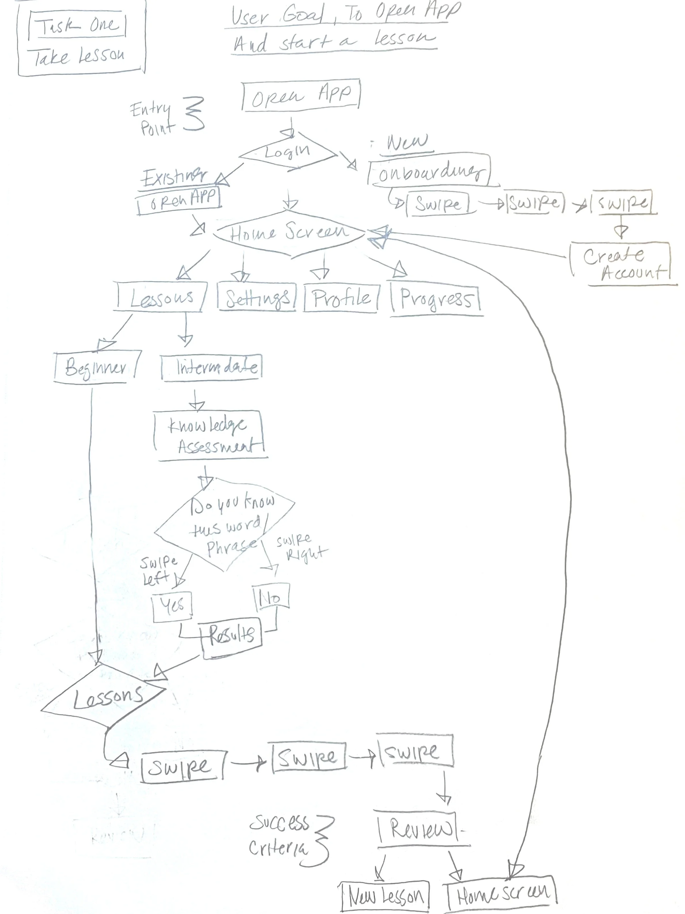
User flows provide the high-level overview of how users navigate through a website or app, while task analysis allows us to delve deeper into the tasks that users need to complete along with the steps that make up each task.
TASK 01:
Language lessons
“I want an app to have flexible and short lessons so that I can study at my own pace.”
- Robin
TASK ANALYSIS
Entry point: Open the App
Success criteria: Complete when you have finished a brief lesson.
Open the App
Clicks on “Login” ⇒ Login Window Appears
Enter Username and Password
Home screen opens
Click on “Profile” ⇒ Profile menu options open
Click on “Lessons”
Choose “Beginner” or “Intermediate”. If “Intermediate” is selected take “Knowledge Assessment” and see “Results”
Take “Lesson”
TASK 02:
Change the language you want to learn
“I want an app that I can easily change the language I am learning depending on my upcoming trip.”
-Robin
TASK ANALYSIS
Entry point: Open the App
Success criteria: Complete when new language is selected.
Open the App
Clicks on “Login” ⇒ Login Window Appears
Enter Username and Password
Home screen opens
Click on “Profile” ⇒ Profile menu options open
Click on “Languages”
Scroll Through “Language Menu”
Select Desired Language
Pop up “Do You Want to start a New Lesson?”
Swipe left to “Start New Lesson” and Swipe right to “Return to Home Screen”
Prototype
Prototype
LOW-FIDELITY WIREFRAMES
After researching the current market, interviewing potential users, creating a proto-persona and a user journey, I next wanted to use that data to make my first attempts at a low-fidelity wireframe.
MID-FEDELITY PROTOTYPE
After sketching some rough layout idea and initial concepts I created a digital prototype using Figma. this allowed me to design an MVP (Minimum Viable Product) that I could use for my user testing.
Test
Test
USABILITY TESTS
Usability testing is an evaluative research method, in that it’s intended to evaluate a prototype or experience. By performing usability testing, you’re evaluating the ability or inability of users to complete specific tasks.
Typically, test participants are asked to complete these tasks while testers watch, listen, and take notes. Results from the tests are then recorded and prioritized to provide direction on the next prototype iteration. This process is repeated until designers are satisfied with the utility, usability, and usefulness of their prototype. In this section I outline the specifications of my usability testing for this project.
DIRECT TASKS
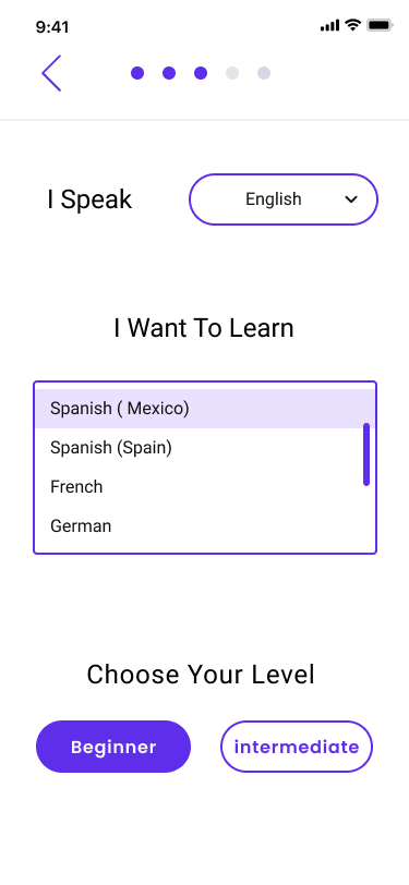
Complete Onboarding process
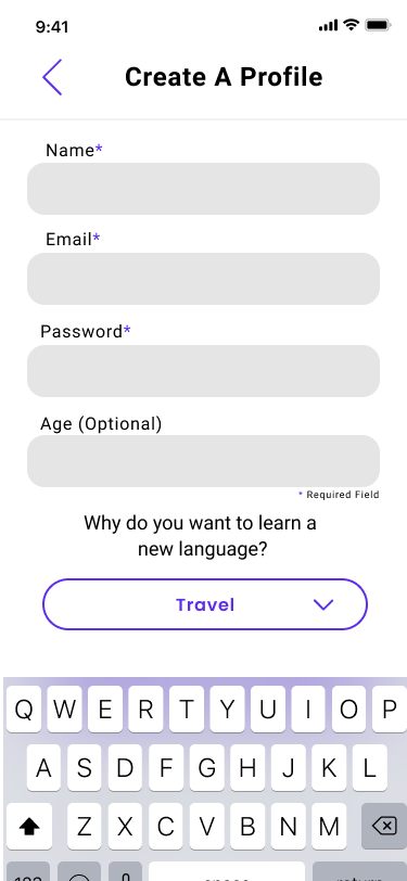
Create Profile On Wanderlust
Complete a Language Lesson
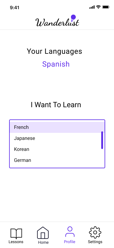
Change learning language
METHODOLOGY
Remote testing using Zoom & Figma, in person testing using Figma
SESSIONS
10-15 minutes per test
PARTICIPANTS
4 participants
-
0 = I don't agree that this is a usability problem at all
1 = Cosmetic problem only: need not be fixed unless extra time is available on project
2 = Minor usability problem: fixing this should be given low priority
3 = Major usability problem: important to fix and should be given high priority
4 = Usability catastrophe: imperative to fix before product can be released
METRICS
Refine the Design
Refine the Design
DESIGN ITERATIONS
Based on the feedback I received from participants during usability testing I made the following iterations to my prototype design to address the frictions they encountered when attempting to complete my four direct tasks
DIRECT TASK 01:
Complete Onboarding process
OBSERVATIONS:
For the onboarding in task 1, most of the feedback consisted of small details like spacing, spelling and better direction for setting a reminder. To remedy this I made the following design iterations:
ORIGINAL
UPDATED
DESIGN ITERATIONS:
Changed the spacing between “Next” and the arrow
Changed all the Capital letters in the sentence
ORIGINAL
UPDATED
DESIGN ITERATIONS:
Removed arrow at the bottom of the scroll
ORIGINAL
UPDATED
DESIGN ITERATIONS:
Added “Select Days” and “Select Time” to the set a reminder page
Lowered “ Maybe Later”
Made “Set Reminder” button larger
DIRECT TASK 02:
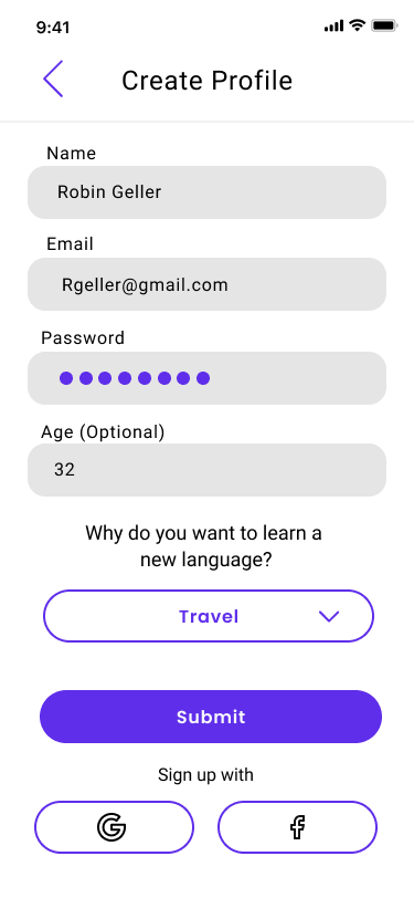
Create Profile On Wanderlust
OBSERVATIONS:
The main feedback I got for task 2 was that I didn’t use an asterisk to notify users of a required field. Also I should label what the asterisk means at the bottom because this assists the blind community.
ORIGINAL
UPDATED
DESIGN ITERATIONS:
Added asterisks for required fields
DIRECT TASK 03:
Complete a Language Lesson
OBSERVATIONS:
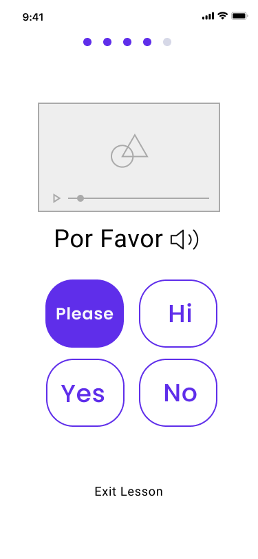
For task 3 I realized I had missed some directions in my lesson and the “Exit Lesson” button was too prominent. Users also had trouble finding where to start the lesson and wanted more information about the lesson on the lesson page and navigating the home page. Users would also like a lesson option on the homepage.
ORIGINAL
UPDATED
DESIGN ITERATIONS:
Used buttons so the answers aren’t mistaken for a scroll
Added directions for the question
Lowered “Exit Lesson”
ORIGINAL
UPDATED
DESIGN ITERATIONS:
Added information about the lesson
Moved additional learning tools to the bottom so they don’t compete as much with the “Start Lesson” button
Moved the “Start Lesson to middle of the page so it’s easier to see
Added a Chat feature
ORIGINAL
UPDATED
DESIGN ITERATIONS:
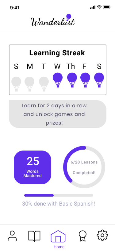
Changed the stats on the homepage so they dont look like a button
Added a button to go straight into a lesson
Labeled the bottom Icons
DIRECT TASK 04
Change learning language
OBSERVATIONS:
For my profile page some of my users had trouble finding it from the homepage because the Icon wasn’t labeled. Some of the buttons on the profile page were unclear . Also it was suggested that the chat feature would be better as a learning tool on the lessons page instead of on the profile page.
ORIGINAL
UPDATED
DESIGN ITERATIONS:
Included more user information to personalize profile.
Added user stats and accomplishments
End Product
End Product
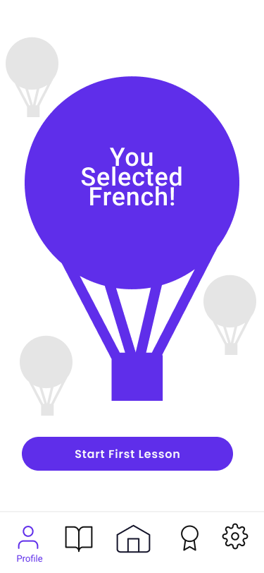
FINAL PROTOTYPE
Through utilizing human centered design I was able to craft a product that followed the data I received through testing and staying true to my persona throughout the evolution of the project.
The end prototype is far different that my early assumptions but a much better user experience as a result of keeping my mind opened and letting the data inform my design decisions.


